What is Box Plot?
This activity allows the user to explore maximum, minimum, median, upper quartile, lower quartile, and outliers.
- maximum is the largest value in the data set.
- minimum is the smallest value in the data set.
- median is a measure of the center. It is the middle value in a list of numbers sorted from least to greatest. If the list has an odd number of entries, the median is the middle entry in the list after sorting. If the list has an even number of entries, the median is equal to the sum of the two middle numbers (after sorting) divided by two.
- upper quartile The median splits the data into two parts: the upper portion and the lower portion. The upper quartile is the median of the upper half of the data.
- lower quartile is the median of the lower half of the data.
- interquartile range is the difference between the upper and lower quartiles and is often abbreviated as IQR.
- outlier is a point in the data set that is much farther from the median than most other points. Outliers are classified as extreme or not. Extreme outliers are data points that are either smaller than the lower quartile minus 3*IQR or greater than the upper quartile plus 3*IQR. In other words, extreme outliers are more than 3*IQR away from the box of the box plot. The non-extreme outliers are less than or equal to 3*IQR away from the box, but more than 1.5*IQR away from the box.
*Note: There are two ways of finding the lower and upper quartiles (Q1 and Q3, respectively), and neither way is standard. To learn more, see the discussion on box plots.
To draw a box plot you must first sort the data from least to greatest, then you must find the median of the entire set of data. Now you must find the median of the upper and lower halves of the data; remember, these medians are called the upper and lower quartiles. Draw a number line starting with the minimum and ending with the maximum. Then plot the median, upper quartile, and the lower quartile on the number line. Finally, draw a box around the upper and lower quartile points and divide the box in two parts at the median. The portion of the number line that is not inside the box is sometimes called the whiskers.
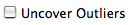
Sometimes, you may have one or more data points that are relatively far away from the rest of the points in your data set. A point that is much farther from the median than the other points are is called an outlier. To see what outliers look like in a box plot, look at the 2006 Gas Mileage by Car Size data in the activity. If you check the "uncover outliers" box, the applet will display the outliers for that data set. Note that normal outliers will be displayed in the same color as their accompanying box plot, while extreme outliers will be displayed in black.
To calculate where the ends of the whiskers go, subtract the lower quartile from the upper quartile to get the interquartile range, and then multiply that by 1.5. For the left-hand whisker, subtract the number you just got from the lower quartile and for the right-hand whisker, add the number you found to the upper quartile. This tells you where the whiskers will go.
Sometimes, calculating the range this way will cause the whiskers to extend beyond the maximum or minimum points in the data in which case, the whiskers are shortened so that they end right at the maximum or minimum points.
Using the 2006 Gas Mileage by Car Size data again, where Q1 = 19 and Q3 = 24, the calculation of the range would be:
24 - 19 = 5
5 * 1.5 = 7.5
19 - 7.5 = 11.5; left-hand whisker
24 + 7.5 = 31.5; right-hand whisker
Therefore, the range is 11.5 to 31.5. However, the minimum data point in the activity is 17, so the lower whisker is drawn at 17. If "uncover outliers" is checked, the upper whisker will be drawn at 31.5, uncovering three outliers at 48, 45, and 40. If "uncover outliers" is unchecked, the upper whisker will simply be drawn at the maximum point in the data set, 48.
References for data sets:
- Amount Spent Per Student is from the U.S. Census Bureau, Public Education Finance: 2005.
- 2006 Gas Mileage by Car Size is from the U.S. Department of Energy and U.S. Environment Protection Agency, 2007.
- NBA Team Payrolls is from the website of Inside Hoops, 2005.
- College's 2004 ACT Scores is from the Western Interstate Commission for Higher Education, 2007.
How Do I Use This Activity?
This activity allows the user to explore maximum, minimum, median, upper quartile, lower quartile, and outliers while learning how to draw box plots.
Controls and Output
-
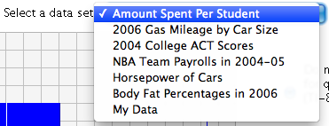
To select your data set use the drop box.
-
Once you have selected the category of data, you can click "Show Statistics" to show the
number of data points in the set (N), the median, upper quartile(Q3), lower quartile(Q1),
minimum, and maximum.

-
You can check or uncheck the "Uncover Outliers" box to determine whether the graph
displays outliers separately from the whiskers. Extreme outliers will be displayed in
black, while other outliers will be displayed in the same color as the box.
-
To change the data set, input new values into the text box at the bottom of the applet. To
enter all new data, click the clear button. You can also change the description of the
data set using the text box directly above the box for the data. When you enter new data,
you can follow it with a comma and a category description and the box plot will be able to
sort the data by those categories.
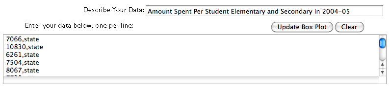
- After you enter the data, you must click the "Update Box Plot" button.
-
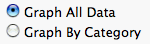
This applet also allows for data to be graphed by category or altogether. Use the radio
buttons "Graph All Data" and "Graph By Category" to control this.
-
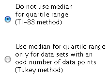
You also have the option of using the median in the quartile range.
-
You can control the horizontal scale by selecting the "Set Horizontal Scale" button.
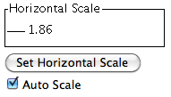
- This will open a pop-up window where you can adjust horizontal scale settings. Selecting "Get Defaults" will set the x-min and x-max to -10 and 10 respectively.
- Adjusting the scale will uncheck the "Auto Scale" button. If you wish to go back to the original scale, you may check this button again.
Description
This activity allows the user to view box plots for either built-in or user-specified data, and experiment with outliers. This activity would work well in groups of two to four for about twenty to twenty-five minutes if you use the exploration questions and ten to fifteen minutes otherwise.
Place in Mathematics Curriculum
This activity can be used to:
- systematically collect, organize, and describe data
- construct, read, and interpret tables, charts, and graphs
- practice calculating median
- explore outliers
Standards Addressed
Grade 6
-
Statistics and Probability
- The student demonstrates an ability to classify and organize data.
- The student demonstrates an ability to analyze data (comparing, explaining, interpreting, evaluating; drawing or justifying conclusions).
Grade 7
-
Statistics and Probability
- The student demonstrates an ability to classify and organize data.
- The student demonstrates an ability to analyze data (comparing, explaining, interpreting, evaluating, making predictions; drawing or justifying conclusions).
Grade 8
-
Statistics and Probability
- The student demonstrates an ability to classify and organize data.
- The student demonstrates an ability to analyze data (comparing, explaining, interpreting, evaluating, making predictions, describing trends; drawing, formulating, or justifying conclusions).
Grade 9
-
Statistics and Probability
- The student demonstrates an ability to classify and organize data.
- The student demonstrates an ability to analyze data (comparing, explaining, interpreting, evaluating, making predictions, describing trends; drawing, formulating, or justifying conclusions).
Grade 10
-
Statistics and Probability
- The student demonstrates an ability to classify and organize data.
- The student demonstrates an ability to analyze data (comparing, explaining, interpreting, evaluating, making predictions, describing trends; drawing, formulating, or justifying conclusions).
Grade 6
-
Statistics, Data Analysis, and Probability
- 1.0 Students compute and analyze statistical measurements for data sets
Grade 7
-
Statistics, Data Analysis, and Probability
- 1.0 Students collect, organize, and represent data sets that have one or more variables and identify relationships among variables within a data set by hand and through the use of an electronic spreadsheet software program
Statistics and Probability
-
Interpreting Categorical and Quantitative Data
- Summarize, represent, and interpret data on a single count or measurement variable
Grades 6-8
-
Data Analysis and Probability
- Formulate questions that can be addressed with data and collect, organize, and display relevant data to answer them
- Select and use appropriate statistical methods to analyze data
Grades 9-12
-
Data Analysis and Probability
- Formulate questions that can be addressed with data and collect, organize, and display relevant data to answer them
Grade 7
-
Number and Operations, Measurement, Geometry, Data Analysis and Probability, Algebra
- COMPETENCY GOAL 4: The learner will understand and use graphs and data analysis.
Grade 8
-
Number and Operations, Measurement, Geometry, Data Analysis and Probability, Algebra
- COMPETENCY GOAL 4: The learner will understand and use graphs and data analysis.
Introductory Mathematics
-
Algebra
- COMPETENCY GOAL 4: The learner will understand and use graphs and data analysis.
-
Data Analysis and Probability
- COMPETENCY GOAL 3: The learner will understand and use graphs and data analysis.
Advanced Functions and Modeling
-
Data Analysis and Probability
- Competency Goal 1: The learner will analyze data and apply probability concepts to solve problems.
Integrated Mathematics
-
Data Analysis and Probability
- Competency Goal 3: The learner will analyze data and apply probability concepts to solve problems.
AP Statistics
-
Number and Operations
- Competency Goal 1: The learner will analyze univariate data to solve problems.
Grade 6
-
Probability and Statistics
- 10. The student uses statistical representations to analyze data.
Grade 7
-
Probability and Statistics
- 11. The student understands that the way a set of data is displayed influences its interpretation.
Grade 8
-
Probability and Statistics
- 12. The student uses statistical procedures to describe data.
Textbooks Aligned
Grade Eight
-
Samples and Populations
- Investigation One: Comparing Data Sets
- Investigation Three: Random Samples
- Investigation Four: Solving Real-World Problems
Book 1
-
Module 3 - Statistical Safari
- Section 4: Mean, Median, Mode, Averages
-
Module 8 - Our Environment
- Section 5: Misleading Averages
Book 2
-
Module 5 - Recreation
- Section 1: Ratios
- Section 1: Proportions
- Section 1: Stem-and-Leaf Plots
- Section 1: Histograms
- Section 2: Scatter Plots
- Section 2: Box Plots
-
Module 7 - Health and Wellness
- Section 3: Customary Units
- Section 3: Writing Inequalities
- Section 3: Box Plots
Book 3
-
Module 1 - Amazing Feats, Facts and Fictions
- Section 2: Stem-and-Leaf Plots
- Section 2: Box Plots
- Section 3: Scatter Plots
-
Module 2 - At the Mall
- Section 6: Graphing Inequalities
- Section 6: Box Plots
7th
-
Module 5 - Recreation
- Section 3: Proportions and Plots
-
Module 7 - MATH-Thematical Mix
- Section 4: Box-and-Whisker Plots and Circle Graphs
8th
-
Module 1 - Amazing Feats and Facts and Fiction
- Section 2: Displaying Data
Book 1
-
What Does the Data Say?
- Lesson 2: Name Exchange
Book 3
-
Looking Behind the Numbers
- Lesson 2: Who's the Best?
Grade 8
-
Insights into Data
- Understanding Graphs
- Gathering Data
- Bias
- Representation of Data
- Correlations
- Scatter Plots
- Box Plots
Grade 5
-
Picturing Numbers
- Bar Graphs
- Line Graphs
- Pie Charts
- Pictographs
- Describing Data
- Using Data for Arguments
Grade 6
-
Dealing With Data
- Scatter Plots
- Box Plots
- Stem and Leaf Plot
- Histograms
- Mean, Median, Mode and Range
Grade 7
-
Statistics and the Environment
- Collecting Data
- Mean, Median, Mode and Range
- Maps
- Graphs and Tables
Be Prepared to
- give implicit directions on what they are to do. For example "Today we are going to explore boxplots. You are going to experiment with the box plot activity and see if you can answer the ..."
- answer the question "how does the computer figure out how to draw it?"
- discuss what outliers are, what they mean, and why are they important.