What is Overlapping Gaussians?
Gaussian curves are used frequently when calculating probabilities of random events. A special
type of Gaussian curve is the
normal distribution which is useful in probability because the area under the curve is 1. Scientists often
encounter data sets that can be represented by Gaussian curves. Whenever continuous measurements
are taken, such as the height of plants, weight of humans, or pH of a mixture, a Gaussian
distribution can usually represent the data. And as the number of data points increases, they
will look more and more like a Gaussian curve.
In the case of weight of humans, if we take a sample of men or women of a certain height, there
will be a lot of subjects that hover around the mean weight. Then as you get further away from
that mean, you will notice fewer and fewer data points with the given weight.
This activity allows the user to view two Gaussian curves in the same window in order to analyze
the possibility of a difference in two data sets. If the areas under the two curves occupy a
similar area then there is statistical reason to believe that they might actually have the same
mean despite a difference in the experimental mean.
The small differences in means that are examined might be due to the difference in
theoretical probability verses experimental probability. When a random sample of a population is taken, it might not reflect the exact parameters of
the entire population. This applet could be used to determine the probability that a random
sample is actually indicative of its population.
Controls and Output
Slider Bars
-
Since the functions are already graphed, you may manipulate the coefficients and constants
of the function with sliders. Manipulating the slider will result in manipulating the graph
in different ways depending on the color of the slider.
- Purple Slider: Adjusts the amplitude or height of the curve. The larger the value of the purple slider, the taller the function will be. This value should always be greater than zero.
- Red Slider: Adjusts the standard deviation or width of the curve. As this value increases, the graph will appear to stretch out horizontally. This value should always be greater than zero.
- Green Slider: Adjusts the mean or horizontal shift of the curve. As you adjust this slider, the graph will slide horizontally. This variable can take on any value.
-
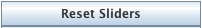
After changing the function with the sliders, you may set the sliders back to the original
values when the function was entered by clicking the
Reset Sliders button.
-
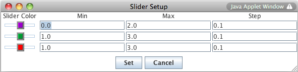
You may manipulate the maximum, minimum, and increment of each slider bar. The
Slider Limits button brings up a dialog box that allows you to set the minimum and maximum values of each
slider bar, as well as the step size for each adjustment of the slider. The step size
determines how precisely you can control the value of the constant. For instance, if you set
the minimum to 0, the maximum to 1, and the step to 0.1, moving the slider will step the
constant from 0 to 0.1 to 0.2, and so on. However, if you set the step to 0.2, the slider
will step the constant from 0 to 0.2, 0.4, etc.
-
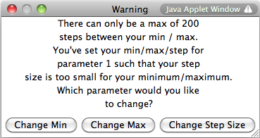
The number of steps between the slider minimum and maximum must be smaller than 200. If you
enter parameters such that the number of steps is greater than 200, then an error message
appears asking you to readjust by changing the slider min, slider max, or step size.
-
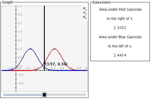
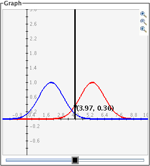
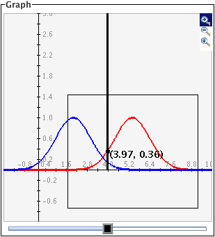
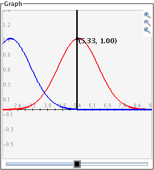
The black slider bar sets a bound for integrals of the two Gaussian curves. For the red
curve, the black slider sets the lower bound for the integral with the upper bound being
infinity. For the blue curve, it sets the upper bound for the integral with the lower bound
being negative infinity. The results of these integrals are displayed in the box labeled
Gaussians.
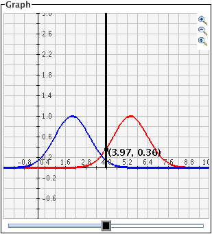
Grid Lines
- There are three types of grids: No Grid, Light Grid Lines, and Dark Grid Lines. To activate any of these three options, highlight the circle next to the appropriate option:
| No Grid Lines | Light Grid Lines | Dark Grid Lines |
|
|
|
This activity allows two ways to alter the range on the axes
-
Setting exact values for axis minimums and maximums: You may set the graph boundaries by clicking the
Set Window button and entering new values for the x max, x min, y max, or y min. You can also set how
the x and y scales increment or you can choose to have the activity choose these values
automatically. Click the
Set Window button to set the values.
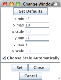 To return the values to their defaults, click the
Get Defaults button and then click the
Set button again. If you do not want to change the window settings you may click
Cancel.
To return the values to their defaults, click the
Get Defaults button and then click the
Set button again. If you do not want to change the window settings you may click
Cancel.
-
Zoom/Pan buttons. In the upper right corner of the graph, there are three buttons with pictures of
magnifying glasses. From top to bottom these buttons represent zoom in, zoom out, and pan,
respectively.
-
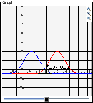
To
zoom in, click the top button to depress it, then click and drag over the area of the graph
that you wish to magnify. The images below show first the process of dragging a box
around a desired zoom area with the mouse (left), and then the resulting zoomed image
after the mouse button is released (right). Note that after the zoom-in has been
performed, the zoom-in button at top right is no longer depressed.
- To zoom out, simply click the second of the three zoom buttons. The graph will automatically zoom out by doubling the min and max values of the axes.
- To pan, click the bottom magnifying glass button to depress it. Click and drag over the graph and the graph will pan around according to the movement of the mouse. Upon releasing the mouse, the pan button is released.
-
To
zoom in, click the top button to depress it, then click and drag over the area of the graph
that you wish to magnify. The images below show first the process of dragging a box
around a desired zoom area with the mouse (left), and then the resulting zoomed image
after the mouse button is released (right). Note that after the zoom-in has been
performed, the zoom-in button at top right is no longer depressed.
-
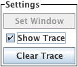
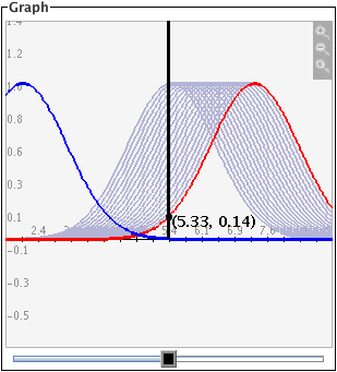
Checking the
Show Trace box will cause old graph lines to remain visible (in a lighter gray) as you change the
function by moving the sliders. To remove the trace, click the
Clear Trace button. To stop the tracing, uncheck the
Show Trace check box.
Description
The Overlapping Gaussian applet is designed to allow the user to shift the parameters on two Gaussian curves and then determine whether a difference in the data sets represented by the curves is likely to exist or not. This activity measures the area under the Gaussian curves, which is a tool used to calculate probabilities in normally distributed data.
This activity would work well for individuals or in groups of two to three for about twenty-five to thirty-five minutes if you use the exploration questions.
Place in Mathematics Curriculum
This activity can be used to:
- Calculate P-values for normal curves
- Teach students how changing different parameters affects a Gaussian curve
- Teach students how the area under a Gaussian curve relates to probability
- Introduce students to Type I and Type II errors
Standards Addressed
Grade 9
-
Statistics and Probability
- The student demonstrates an ability to classify and organize data.
- The student demonstrates an ability to analyze data (comparing, explaining, interpreting, evaluating, making predictions, describing trends; drawing, formulating, or justifying conclusions).
Grade 10
-
Statistics and Probability
- The student demonstrates an ability to classify and organize data.
- The student demonstrates an ability to analyze data (comparing, explaining, interpreting, evaluating, making predictions, describing trends; drawing, formulating, or justifying conclusions).
Statistics and Probability
-
Interpreting Categorical and Quantitative Data
- Summarize, represent, and interpret data on a single count or measurement variable
Grades 9-12
-
Data Analysis and Probability
- Develop and evaluate inferences and predictions that are based on data
- Formulate questions that can be addressed with data and collect, organize, and display relevant data to answer them
- Select and use appropriate statistical methods to analyze data
Advanced Functions and Modeling
-
Data Analysis and Probability
- Competency Goal 1: The learner will analyze data and apply probability concepts to solve problems.
AP Statistics
-
Data Analysis and Probability
- Competency Goal 3: The learner will collect and analyze data to solve problems.
-
Geometry and Measurement
- Competency Goal 2: The learner will construct and interpret displays of univariate data to solve problems.
-
Number and Operations
- Competency Goal 1: The learner will analyze univariate data to solve problems.
Be Prepared to
- Explain Gaussian/Normal Curves
- Explain Mean/Standard Deviation
- Explain how P-values are calculated
- Introduce Type I/Type II errors