What is Scatter Plot?
This applet allows the user to input a series of (x,y) ordered pairs and plot them either as a connected function or unconnected data points. Parameters such as minimum and maximum x value, minimum and maximum y value, and x- and y-scale can be set by the user or determined by the applet.
The coordinate plane system was developed by a sick mathematician. As Rene Descarte lay in bed
sick, he saw a fly buzzing around on the ceiling. His ceiling was made of square tiles. As he
watched, he realized that he could describe the position of the fly by the ceiling tile it was
on. After this experience, he developed the Cartesian coordinate system in the 17th century to
help visualize functions via plotting function values as ordered pairs. In this system a grid
of evenly spaced horizontal and vertical lines is drawn, a center or "origin" is chosen, and
horizontal and vertical scales are chosen. Here's an example:
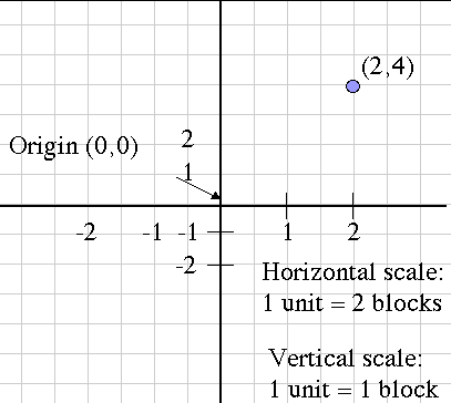
Notice that the horizontal and vertical scales are different, but each one considered alone is evenly spaced. Also, the blue point is labeled with its Cartesian coordinates , the horizontal and vertical movement from the origin, in that order. This is the mathematical convention for naming points.
Another name for the horizontal movement value is the abscissa, and the vertical movement is the ordinate. These terms are more rare now than they used to be, but you might still hear them being used.
How Do I Use This Activity?
This applet allows the user to input a series of (x, y) ordered pairs and plot them. Parameters such as minimum and maximum value, minimum and maximum y value, and x- and y-scale can be set by the user or determined by the applet.
Controls and Output
-
The area at the top of the screen is where the plot is displayed.
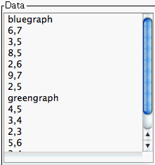
- The text field labeled Data is where you input the points you want to graph. The points should be in the form (x, y). The parentheses are optional, the x and the y can be separated by a tab or a space and there must be a carriage return between each coordinate pair.
-
You can plot up to ten
sets of points. To do this, separate each set of points by the word
newgraph on a line by itself. You may also specify the color of your graphs by using the following
keywords in place of
new graph:
redgraph, bluegraph, greengraph, purplegraph, crimsongraph, magentagraph, orangegraph,
blackgraph, cyangraph, graygraph, and
yellowgraph. If you specify
newgraph each time, the colors will iterate through the order listed.
- After you input the coordinates, you must press the Plot/Update button to graph them.
- If you have trouble copying data from the applet and pasting it into an Excel spreadsheet, please see our Excel Copy/Paste Help.
-
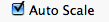
Note that if the
Auto Scale box is checked, Scatter Plot will choose appropriate x- and y-axis values for you to view
all data on the graph. If you uncheck that box, you can override Scatter Plot's values
with your own. This is explained below in the
Set Window note.
-
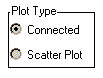
You can choose from two
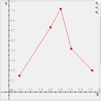
plot types. "Connected" draws a line from one point to the next. (Note that before the line is drawn
the points are sorted by their x coordinates.) "Scatter Plot" just draws the points as
dots on the graph.
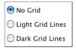
-
There are three radio buttons which control the gridlines on the graph. You can chose no
grid, light grid lines, or dark grid lines by selecting the appropriate radio button.
-
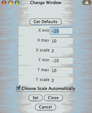
Click the
Set Window button to change how the graph will appear on your screen. A new browser window should
open after you push the button and inside that new window you will be able to adjust
values. X min and X max are the minimum and maximum x-values displayed on the graph.
Similarly, Y min and Y max are the minimum and maximum y-values displayed on the graph.
The X scale is the distance between vertical gridlines if
Show Grid is checked. The Y scale is the distance between horizontal gridlines if
Show Grid is unchecked. Any changes you make to the window parameters will take effect the next
time you click the
Plot/Update button. When you are finished, push the
Set button followed by the
Close button to set the changes and to leave the window. Also note that while the
Choose Scale Automatically box is checked, X and Y scale text boxes are uneditable.
-
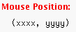
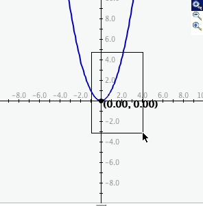
The applet also can tell you the location of any click. Just click the mouse anywhere on
the graph that you want to know the coordinates of and the coordinates will appear in the
Mouse Position field.
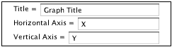
- By entering text into the Title= field you can change the title of your graph. After changing the title hit plot to see the new title at the top of your graph.
- By entering text into the Horizontal Axis = field you can change the title of your x axis.
-
By entering text into the
Vertical Axis = field you can change the title of your y axis.
-
Zoom/Pan buttons. In the upper right corner of the graph, there are three buttons with pictures of
magnifying glasses. From top to bottom these buttons represent zoom in, zoom out, and pan,
respectively.
-
To zoom in, click the top button to depress, then click and drag over the area of the
graph for which you wish to zoom to. The images below show the preimage as the user
drags over the area in which to zoom and the resulting zoomed image. Note that after
clicking and dragging over the selected area, the zoom in button is automatically
released.
- To zoom out, simply click the middle button. The graph will automatically zoom out by doubling the min and max values of the axes.
- To use the pan feature, click the bottom magnifying glass button to depress it. Click and drag over the graph and the graph will pan around according to the movement of the mouse. Upon releasing the mouse, the pan button is released.
-
To zoom in, click the top button to depress, then click and drag over the area of the
graph for which you wish to zoom to. The images below show the preimage as the user
drags over the area in which to zoom and the resulting zoomed image. Note that after
clicking and dragging over the selected area, the zoom in button is automatically
released.
Description
This applet allows the user to input a series of (x,y) ordered pairs and plot them either as a connected function or unconnected data points. Parameters such as minimum and maximum x value, minimum and maximum y value, and x- and y-scale can be set by the user or determined by the applet. This activity would work well in groups of two to four for about forty-five minutes if you use the exploration questions and twenty minutes otherwise.
Place in Mathematics Curriculum
This activity can be used to:
- illustrate the Cartesian coordinate system
- practice students' pattern recognition skills
- practice students' graph reading skills
- illustrate the relationship between graphical and algebraic representations of functions
Standards Addressed
Grade 6
-
Statistics and Probability
- The student demonstrates an ability to analyze data (comparing, explaining, interpreting, evaluating; drawing or justifying conclusions).
Grade 7
-
Statistics and Probability
- The student demonstrates an ability to analyze data (comparing, explaining, interpreting, evaluating, making predictions; drawing or justifying conclusions).
Grade 8
-
Statistics and Probability
- The student demonstrates an ability to analyze data (comparing, explaining, interpreting, evaluating, making predictions, describing trends; drawing, formulating, or justifying conclusions).
Grade 9
-
Statistics and Probability
- The student demonstrates an ability to classify and organize data.
- The student demonstrates an ability to analyze data (comparing, explaining, interpreting, evaluating, making predictions, describing trends; drawing, formulating, or justifying conclusions).
Grade 10
-
Statistics and Probability
- The student demonstrates an ability to classify and organize data.
- The student demonstrates an ability to analyze data (comparing, explaining, interpreting, evaluating, making predictions, describing trends; drawing, formulating, or justifying conclusions).
Eighth Grade
-
Statistics and Probability
- Investigate patterns of association in bivariate data.
Statistics and Probability
-
Interpreting Categorical and Quantitative Data
- Summarize, represent, and interpret data on two categorical and quantitative variables
Grades 3-5
-
Data Analysis and Probability
- Formulate questions that can be addressed with data and collect, organize, and display relevant data to answer them
- Select and use appropriate statistical methods to analyze data
Grades 6-8
-
Algebra
- Understand patterns, relations, and functions
-
Data Analysis and Probability
- Develop and evaluate inferences and predictions that are based on data
- Formulate questions that can be addressed with data and collect, organize, and display relevant data to answer them
- Select and use appropriate statistical methods to analyze data
Grades 9-12
-
Algebra
- Analyze change in various contexts
-
Data Analysis and Probability
- Formulate questions that can be addressed with data and collect, organize, and display relevant data to answer them
- Select and use appropriate statistical methods to analyze data
Grade 4
-
Number and Operations, Measurement, Geometry, Data Analysis and Probability, Algebra
- COMPETENCY GOAL 4: The learner will understand and use graphs, probability, and data analysis.
Grade 6
-
Number and Operations, Measurement, Geometry, Data Analysis and Probability, Algebra
- COMPETENCY GOAL 5: The learner will demonstrate an understanding of simple algebraic expressions.
Grade 8
-
Number and Operations, Measurement, Geometry, Data Analysis and Probability, Algebra
- COMPETENCY GOAL 4: The learner will understand and use graphs and data analysis.
Introductory Mathematics
-
Algebra
- COMPETENCY GOAL 4: The learner will understand and use graphs and data analysis.
-
Data Analysis and Probability
- COMPETENCY GOAL 3: The learner will understand and use graphs and data analysis.
Advanced Functions and Modeling
-
Data Analysis and Probability
- Competency Goal 1: The learner will analyze data and apply probability concepts to solve problems.
Integrated Mathematics
-
Data Analysis and Probability
- Competency Goal 3: The learner will analyze data and apply probability concepts to solve problems.
Algebra I
-
Foundation for Functions
- 1. The student understands that a function represents a dependence of one quantity on another and can be described in a variety of ways.
Textbooks Aligned
6th
-
Module 6 - Comparisons and Predictions
- Section 2: Rates
- Section 3: Using Ratios
7th
-
Module 5 - Recreation
- Section 3: Proportions and Plots
8th
-
Module 1 - Amazing Feats and Facts and Fiction
- Section 2: Displaying Data
- Section 3: Equations and Expressions
Be Prepared to
- answer the question "How can I tell if the data has a relationship?"
- discuss the concepts of positive relationships, negative relationships, data collection, etc.